Tuesday, October 21, 2014

Moved to Maine!

After having lived in Brookline 34 years (and the Boston-area since 1968, minus 2 years in New York City), I suddenly moved to Maine with my new puppy and my husband in January. It all came about because I fell down stairs and broke my arm while on our usual August vacation in Maine. Since kayaking was out, we amused ourselves by touring historic houses and then by house-hunting, a dangerous pastime! We found the perfect spot in October – ironically on the internet, made an offer, put our condo on the market, and by December we had closed (in the middle of a blizzard). We moved January 20. Only then did we realize we needed to do a lot of renovation, which has pretty much pre-occupied me until recently. (See my Pinterest board: http://www.pinterest.com/marthajanebrad/moving-to-maine/ )

My downstairs display room is the crowning jewel. It is called Martha’s Underground because I don’t want to use the word “basement,” which is where it really is. I am delighted with the space. What a change from the way it looked when we started! http://www.pinterest.com/marthajanebrad/marthas-underground/ Upstairs I have a clean room for my computer equipment and a “dirty” room for varnishing, gluing, and the like.


I have now uploaded my entire portfolio to Pinterest: http://www.pinterest.com/marthajanebrad/ And I am delighted to say that I now have a pin button on my splash screen at http://www.marthavista.com/ as well as a LinkedIn button.

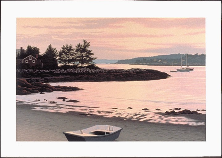
Moving to Maine has proved to be one of the best things I ever did. I have ancestors from nearby Damariscotta and Round Pond, I have spent part of every summer here since I was 2, I have always felt my heart was here and that I was living in exile, and the Maine landscape has been a huge part of my artwork. Finally I am home! (What took me so long?) Oddly, this isolated, rural little spot is proving to be far friendlier and more supportive than the Boston-area. My neighbors have quickly become good friends. “Girls Night Out (GNO),” a Tuesday gathering at a local bar, has been a great way to meet and network with other women. My work has been well-received: I sold a couple of digital collages at the MaineArtShow at St. Andrew’s Parish House in Newcastle, and when I hosted GNO here (we meet in each other’s houses during the tourist season), I sold 2 more prints. One of these prints, “Pemaquid Harbor,”

”Pemaquid Harbor,” serigraph, 23 x 36,” $800 at www.marthavista.com

is destined to hang in an historic house in Bremen in the same spot where “Dark Harbor Fishermen” by N. C. Wyeth used to hang! The art community here is huge – there is a joke that there are more artists in Lincoln County than people. And the artists have been very helpful with advice about shows to enter and information about galleries.

The last lap in this marathon is to get my storage space built in the – yes – basement and my work unpacked. Then I can put my energy on new work and seeking out show opportunities more assiduously.

Last month I finished my entry for the 2015 show Look Again: ACM Collection Inspires The Boston Printmakers at the Art Complex Museum in Duxbury MA. For this collaborative exhibition, ACM's contemporary curator Craig Bloodgood and collections manager Maureen Wengler have selected 42 works for response pieces to be created by members of The Boston Printmakers. I chose Thomas Nason’s “Mountain Stream, an engraving showing water rushing under a woodland bridge.” In exploring his body of work, I felt a great correspondence between our styles and subject matter. My response piece, a digital drawing, is called “Another Stream.” It also shows a forest bridge but the stream has been reinterpreted as the history of foot traffic over the bridge.

Thomas Nason, “Mountain Stream,” 1948-1949, wood engraving, 6 x 7 ¾, courtesy of The Art Complex Museum

“Another Stream,” digital drawing, 9 x 12,” $400 at www.marthavista.com

I recently joined River Arts, a non-profit arts organization on Route 1 in Damariscotta, the heart of Midcoast Maine. http://riverartsme.org/ River Arts is strongly community-oriented and provides art instruction, exhibitions, and special events.

My digital drawing, “Nasturtium,” was accepted into the 2014 Butler Institute of American Art’s 78th National Midyear Exhibition. The juror was artist Ben Schonzeit. The show ran from July 27 through September 7 in Youngstown OH. “Nasturtium” has an oriental feel. There is an interesting tension between the close-up focus on the single white flower and the long distance focus of the background landscape.

“Nasturtium,” digital drawing, 28 x 14,” $1000 at www.marthavista.com

My black and silver acrylic painting, “View from the Other Side,” is included in “Creative Community: Danforth Art in Collaboration with The Art Connection, on view from October 8–December 14 in Framingham MA. The Art Connection is a Boston-based organization that connects artists to underserved communities through the donation and placement of original contemporary artwork in area social service agencies.

“View from the Other Side,” acrylic on canvas, 1992, 72"x48", originally $6000

Work in this exhibition is available for placement in MetroWest social service agencies. If you are a representative of a social service agency interested in selecting art work, please contact Danforth Art Assistant Curator Jessica Roscio at 508.620.0050 ext. 12 or jlroscio@danforthart.org. Social service agencies may find information about eligibility at The Art Connection website, www.theartconnection.org.

“Tamago,” a print from my virtual immersive art installation Acquarella is included in The Boston Printmakers new publication Palate to Plate: Prints and Recipes from Members of the Boston Printmakers. This full-color, 216-page book is also the catalogue for the 2014 Boston Printmakers Members' Exhibition at the Newport Art Museum. The book contains prints and favorite recipes by 99 members of the Boston Printmakers and is available through www.blurb.com. The show runs from August 30, 2014 – January 4, 2015. The Newport Art Museum is at 76 Bellevue Avenue, Newport, RI 02840. Link to the show: www.newportartmuseum.org/Exhibitions/Now-on-View/Palate-to-Plate

“Tamago,” digital screen-capture on canvas, 18 x 27 on 23 x 32,” $950 at www.marthavista.com


Tuesday, November 5, 2013

Fragile Harmony

Black Diamond, 45 x 32 inches

Selected works from past shows make a rare reappearance in this comprehensive exhibit of my digital drawings from the last fifteen years. The show's full title is Martha Jane Bradford: Fragile Harmony.

The exhibit opened November 1 at the Athan's Cafe Art Gallery in Brighton, Massachusetts (USA). It will run until January 1, 2014. The Cafe Gallery is located at 1621 Beacon Street (Washington Square in Brighton). It is open 8 am - 11 pm every day. The public reception will be on November 17, 2013 from 6 – 7:30 pm.

This exhibition is sponsored by Unbound Visual Artists, Inc., and was curated by John Quatrale of the UVA Board of Directors.

Unbound Visual Arts. Inc. - http://www.unboundvisualarts.org/
Athan's Brighton - http://www.athansbakery.com/
phone: 617-783-0313
google map: http://www.athansbakery.com/locations.html
 
My links are on the sidebar to the right. If you would like to subscribe to my (infrequent) newsletters, please go to http://www.marthavista.com/contact.html

A view of part of the installation at Athan's

Thursday, October 24, 2013

How to Make the Rods for a Hanging Scroll

Summer vacation, a broken right arm, and a new puppy later …

Now I am back at last to where I left off. I described how to construct a hanging scroll in my May post. This one will cover making the hanging rods.

You need the following equipment:
--birch dowels 1/4” - 1 1/4” in diameter depending on the size of the scroll)
--carpenter's ruler
--pencil
--a miter box and miter/chop saw (manual tools)
or
--a mechanical miter/chop saw with at least a 3 1/8 inch blade (mine is made by TruePower)
--a 1/8 – 1 1/4” pipe cutter (mine is Mag-Bit)
--a nail file
--a hand-held sander, either manual or mechanical (mine is a Makita)
--medium grit sand paper
--steel wool grades 1, 0, and 00
--high-gloss acrylic interior/exterior enamel (I used Behr Premium Plus)
--paint stirrer
--screw driver
--paint brush (I used an artist's 1” Windsor Newton University Gold B)
--water jar for cleaning the brush
--a heavy pottery jar for standing the rods in to dry
--rags or paper towels
--mono-filament (fish line, etc.)

Measure the width of the hanging scroll. Add 1 ½ inches, more or less depending on the size of the scroll, to the width to get the length of the top rod and 2 ½ inches, more or less depending on the size of the scroll, to get the length of the bottom rod. I like having the bottom rod heavier and longer than the top rod. For “White Violets,” which is 18 x 24 ½,” I used a ½ “ diameter dowel for the top rod and a 5/8” dowel for the bottom rod.

After marking the dowels with a pencil at the appropriate place to cut, use a miter box and miter/chop saw or a mechanical miter/chop saw to cut the two dowels to the desired lengths.

Sand the cut ends smooth and then bevel edges gently with the sander at a 45 degree angle.

To make the grooves for the hanging filament, score the ends of the top rod only with the pipe cutter. I usually put the grooves about ½ inch in from the ends. Widen the grooves with a nail file so that they will hold the hanging filament in place.

Next, steel-wool the rods smooth starting with grade 1 and progressing to grade 00.

Open the paint can with the screw driver and stir the paint well. Paint from the end to the middle of each rod, checking the ends of the rods for good but not excessive coverage. Stand the rods dry-end-down in the heavy jars to dry. When they are dry to the touch, repeat the painting process for the other halves of the rods. When both rods have been completely painted and are thoroughly dry, steel-wool them smooth starting with grade 1 and progressing to grade 00. Repeat this paint process until the rods are as glossy as you want them to be (usually 2 or more coats).

Insert the finished rods in the hanging pockets of the scroll. Tie the desired length of mono-filament Into the groove at one end of the top rod. Tie a loop in the other end of the filament and set the loop into the remaining groove at the other end of the top rod. (Making one end of the mono-filament removable helps when it comes to packing the scroll for shipment.)

That's all! Now you have an elegant presentation of your artwork that has no glass barrier between it and the viewer, didn't cost a fortune in framing, and is light-weight and easily transportable or shipable.


If you would like to subscribe to my (infrequent) newsletters, please go to http://www.marthavista.com/contact.html

Friday, May 17, 2013

How to make a hanging scroll

In my last post I mentioned that my new print, "White Violets," will be presented as a hanging scroll. It occurs to me that some people might benefit from learning what I have discovered about making these scrolls.

But first of all, the WHY? The answer is easy - the art looks better. There is no glass and frame to confine the art and separate the viewer. Plus, it is much cheaper than framing, and the scroll is light and therefore easier to handle, ship, and store.

OK, now for the HOW. I start by printing my digital drawing on Premier Generations Satin Canvas, museum grade, which I buy in 17" rolls. I use an Epson 4000 with Epson Ultrachrome Ink (archival). This is indeed an old machine but it still prints beautifully and has never needed a repair (knock on wood!) I print 15" wide on 17" canvas, and if my image is wider than that, I print it in panels cropped so that there is a 1/8 inch image overlap on each panel.

The picture below shows how I add guide lines to the image file so that I know where to crop. The red line indicates where the center panel will be folded under. The aqua line shows where to crop the center panel so as to maintain the 1/8 inch overlap, and the green line shows where to crop the left panel.


Here's a close-up that shows the colored lines, which are not in the final print, and the light grey fold lines, which do print and show me precisely where to fold the side hems and top and bottom rod pockets. In the lower right corner, a diagonal grey line is visible. This tells me to taper the hem inwards so that when the pocket is folded, the backside of the pocket has no chance of sticking out the sides.


I also print this little vertical mark at the top and bottom edges to show me where to fold the center panel side hems and where the center panel should fall on the right and left panels.


I air-dry the prints for 30 minutes and then put them between sheets of acid-free paper for 48 hours so that the glycerol in the ink can be absorbed.

Next comes the process of varnishing the prints, which makes them lightfast and resistant to moisture and air pollution. I use a water-soluble varnish, PremierArt Eco Print Shield, diluted with 20% distilled water, and I pour the mixture into a housepainter's tray through a fine sieve (to remove any congealed varnish that may have dried on the inside of the plastic container). I apply it sparingly with a 6-inch foam roller. It is important to move very quickly and to roll only once over any part of the surface because the ink can dissolve into the varnish and smear. I ignore any missed spots, which I can correct during a subsequent coat. Drying time between coats should be at least 30 minutes. I generally apply 2 coats of varnish to the back of the canvas and 5 or 6 coats to the front. The thicker the varnish is on the canvas the less likely it is to crack when folded. The varnish takes a week to cure completely.

"White Violets" is printed in 3 panels. After the varnish is cured, I fold the vertical sides of the center panel under, positioning the fold 1/8" inside the printed image so that the image wraps around the fold and the edge is hidden. I put the center panel face down and paint one of the folded edges with LinecoNeutral pH PVA Adhesive. I paint the corresponding margin of one of the side panels, which is face-up, with the same adhesive. I tape a double strip of canvas to the back of the center panel to prevent a dent along the seam when the print is weighted.


This picture shows the double strip taped in place on the right side of the seam.


Then I turn the panels face up, protect the surface with wax paper, and place a 2-ply strip of matte board to the outside of the seam, again to prevent weight dents. These two types of spacers make a level surface for the weights.


I center a 4-ply strip of mat board directly on top of the seam to distribute the weights evenly.


Then I put my art library to excellent use as gluing weights.


That last strip of mat board I mentioned prevents the gap between the two piles of books from showing up as an uneveness in the seam. I let the glue set for 24 hours.

The picture below shows a side hem tapered inward as per the guideline in the second picture at the beginning of this post. As you can see, I cut a small notch in the hem to make the tapering easier.


Once the center seams and side hems are complete, I fold the bottom rod pocket as shown in this picture. I have found that a two-fold pocket holds much better than simply folding the bottom up once. I use the edge of the fold to draw a pencil line as a guide for where to place the glue and then put a second line 1 inch lower as a parallel glue guide. I paint glue on both surfaces of the seam.


Again I add a last strip of mat board to prevent the gap between the two piles of books from showing, pile on the books, and let the glue set for 24 hours.


The top rod pocket is created using the same method. Here is the back view of the completed scroll.


And - tadah! _ here is the front view.


In my next blog post I will describe making the rods. That needs to happen soon as this print was accepted into the "A Community of Artists" show juried by Katherine French at the Danforth Museum, Framingham MA, and needs to be delivered by next Friday!

http://www.danforthart.org/juriedexhibitions2013.html


Monday, April 22, 2013

White Violets...done at last


"White Violets" is finally finished.

It was a bit of a struggle at the end. My first attempt at the white highlights seemed very crude to me. Here is a snapshot:


(As you may remember, this drawing is done with 6 values: black, four shades of grey, and white. To see earlier stages of the drawing and read a bit about my process, please look at my previous blog posts.)

I wasn't at all satisfied with that so I set about refining the modeling. When working at a low resolution - this drawing is done at 144 ppi - every pixel counts, and it is hard to get precisely the right smooth tonal transitions. In the end, I spent weeks improving the tonal transitions and proofing.


Once I was happy with the violets, I decided I didn't like my background. A section of my drawing "Salt Mist" with a layer of transparent black over it, it seemed far too flat and monotone. After a few days of trying new backgrounds, I found another section of "Salt Mist" that made the drawing more dramatic.

I love the way the angles of the spruce branches both echo and contrast with the angle of the violet leaves, the way the violet seems to spring off the page, and the light filtering through the branches and fading to fog on the left. And I find something intriguing in the contrast of scale, the tiny violet drawn large and the 80 foot spruce drawn small.

I prepared the image for printing on canvas to be stretched and put into a Nielsen frame. Then I decided I really didn't like the way the frame closed in the image. So I redid the presentation. It is now a hanging scroll. The image has room to breathe and nothing comes between it and the viewer.


On the promotional front, I have joined an online gallery called TurningArt. The Boston Business Journal describes the venture this way:

"The Boston-based startup offers a Netflix-like subscription mail model that allows people to rent pieces of wall art on a rotating schedule... the dual purpose of TurningArt, according to founder Jason Gracilieri: To make art more accessible to the masses, and in turn, make the masses more accessible to artists...The nine-employee company, founded in early 2010, works only with artists who are living and independently employed — there are no Monets or Warhols in the mix. So, in addition to bringing a little culture to its user’s lives, TurningArt provides a platform for artists to present and ultimately sell their work...On the other end, the program costs nothing for member artists, who get a piece of the membership costs, as well as a cut whenever their work sells...The company is backed by $2.25 million in funding — $750,000 from a seed round in March 2011 led by NextView Ventures of Boston, and another $1.5 million in May 2012, also led by Next-View..."

I attended The Boston Printmakers annual meeting April 5 at the home of Liz Shepherd (www.lizshepherd.com). Great food as always, an upbeat report from the superbly-organized board about accomplishments and excellent financial standing, but best of all was the Open Portfolio session, where we all spread our work out on tables and shared ideas. I met Tamar Etingen and fell in love with her gelatin monoprints: www.tamaretingen.com. She was kind enough to invite me to her studio and give me a thorough demonstration of the process, which she likens to improvisational jazz. The prints are stunning compositions using everything from leaves and grass to metal washers and bits of rope, done with layers of transparent acrylic paint that glow on the paper like stained glass.

Lastly,I would like to remind everyone about The Boston Printmakers 2013 North American Print Biennial, open for entries until June 25, info here: http://www.bostonprintmakers.org/biennial.html


Monday, March 4, 2013

White Violets...nearly done!


Value 4 is finished. I am at that point close to the end where the vision of how wonderful the image will be when it is finished is really pressing hard. Look out! There is always a let-down at the end.

If you want to see earlier stages of the drawing and read a bit about my process, please look at my previous blog posts.

I have some good news from outside the studio. Lydia Gordon, Lending Artist Coordinator from the DeCordova Corporate Program, emailed me that one of their corporate members, a law firm, wants to buy my large digital charcoal Meridiem. I also got a congratulatory email from Elizabeth Geller, who heads the program. I was happily reminded of all the good times when she worked at Clark Gallery. You can see Meridiem here: http://bit.ly/WIxce1

Interested artists can find out about how to apply to the DeCordova Corporate Program at this link: http://www.decordova.org/search/node/Corporate%20Lending%20program

My hand-colored etching, Freeman and Powell (http://bit.ly/ZLFC8f ), is one of 12 artworks selected for ART BINGO, a benefit for The Art Connection. The jurors are Leonie Bradbury, Director and Curator of Montserrat College of Art Galleries, and Carolyn Muskat, a Tamarind Master Printer, Owner of Muskat Studios (http://muskatstudios.com/), and a visiting teacher at the School of the Museum of Fine Arts, the Art Institute of Boston, and the Massachusetts College of Art and Design. Art Bingo will be held at the Ben Franklin Institute, 41 Berkeley Street, in Boston's fashionable South End from 7:30 - 11:00 pm on Saturday, April 20th. The Art Connection connects artists and donors to community service organizations through the placement of original artwork (their web site: http://www.theartconnection.org/). Please consider supporting The Art Connection and buy tickets here: http://artbingo.eventbrite.com/#

On the virtual front, I have a plot on the Arts and Literature sim of the InWorldz Events Sims Showcase at the popular SXSW Conference of Technology, Music, and Film http://sxsw.com/ I have installed my immersive art, The Niagara River, among a number of other eye-popping builds by other virtual artists. The build is a visual interpretation of a poem by the same name by Kay Ryan and uses my digital drawing, Dark Pool, as the thematic texture.

The South by Southwest® (SXSW®) Conferences & Festivals (March 8-17, 2013) offer the unique convergence of original music, independent films, and emerging technologies. Fostering creative and professional growth alike, SXSW® is the premier destination for discovery.

InWorldz will be displaying a walkthrough of the world at the conference where people will be able to log on and actually visit the various sims featuring Education, Arts & Literature, Entertainment, Technology, Fantasy & Roleplay, Transportation, and Boating & Nature.


Overview at sunrise.


The beginning of the path.


The drawing and the poem together.


The end of the path.


The entrance to the installation.


A touch opens the door.


A view of the inside.

My installation Acquarella appears in the promotional video InWorldz has recently produced, working with machinamist Pooky Amsterdam. Here is the youtube link: http://youtu.be/GupNV8DBwRA You have to scroll to about the 5:30 mark to see the footage.

Last but not least, another link, this time to a very interesting article in The New York Times about how art enhances life.
http://www.nytimes.com/2013/02/17/opinion/sunday/why-we-love-beautiful-things.html?_r=2&)


Wednesday, February 13, 2013

A Progress Report_White Violets


Value 3 is finished. The modeling is starting to emerge.

I just realized that this image is my present, a plant in my studio, superimposed on my past, a take from "Salt Mist" (2000).